FreskPage goes live
May 08, 2012
FreskPage helps app developers and marketers to create beautiful landing pages for their apps in minutes. This works both for mobile apps and web apps.
Since a while, I regularly create a lot of landing pages for apps I'm working on, for several reasons: pre-launch an app, run A/B test, run Adwords campaigns, etc. So I looked for a way to automate the building process, as I want to build basic pages and generate a lot of versions quickly. Not happy with existing solutions - some are too much featured, some generate layouts I don't like, some are not specific for mobile and web apps - I finally built a tiny app for myself and enjoy using it.
Some friends and unknown visitors on these pages ask me with which tool I've build them. They were like the kind of pages they also looked for. And when I told them that I used a personal tool, they wondered if they could use too. So I eventually released it as a product named FreskPage.
Landing Pages for Web & Mobile Apps
I'm used to create landing pages for mobile & web apps. As you probably noticed if you've looked at some, 90% of this pages are similar (including those of very popular apps such as Instragram) and it's a bit more obvisous about mobile apps.
You can create lots of pages introducing your apps. And as doing marketing before launch is important (you can read the article about the big 4 of pre-launch marketing), you can easily build a page to capture email addresses and engage visitors into raw leads.
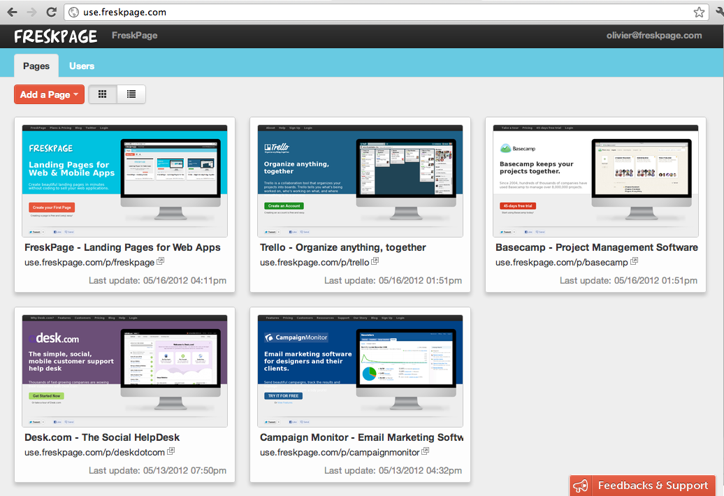
Goodbye Stores and Products concepts in the first draft, we simplify the prototype to focus on creating landing pages. In one glance, the new dashboard shows you all pages that have been created so you can quickly edit them, and helps you to easily create new ones.
A Useful and Colorful User Interface
Exit the original sad dashboard in black & white for a colorful interface! I had purposely not worked that much on this to optimize the time-to-market of the prototype. We wanted to put the product as quick as possible in the hands of users to get their feedbacks. But we realized we did not like the product we were using. How others could like to use it? So we took care to rethink the visual design for this new version.
Eventually we put in a punchy blue and a grapefruit color to make the user interface pleasant, beautiful and fun. Cards for pages are larger and now supports a thumbnail of the created page, which helps you to recognize a page at first glance. You are also able to switch from cards to a list with various filters that help you find the pages you want very quickly. Which sounds good when you have a few.
It's easy to start playing with FreskPage
explainations
What's next?
Feel free to sign up ... It's free!
Enjoyed the article?
I'm sharing what I build and learn on SaaS products strategy and SaaS distribution. And I'm learning a lot, so will you! Delivered once a month for free.
I won't spam you or sell your address. Unsubscribe - of course - at any time.